top of page

CREATING SOLUTIONS
>


1/6
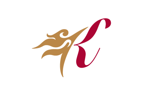
Kirin Parkview Hotel
The concept of the identity is based on the horn of a kirin, together with a script letter K to transform into a stylish branding. The symbol is crafted with a flavour of East Mees West. The horn motif is always applied in gold on all stationery. We also developed it into a sea of pattern as a secondary graphic, which gives the branding a modern flair.
bottom of page